Thursday, May 31, 2012

Productive!

I have had a busy couple of days and have been pretty happy with the cards I've made!


This card was for today's Ways to Use It challenge on Splitcoast Stampers.  The challenge is "Let's Get Negative," and the idea was to use the negative left behind after using a die cutter or punch to cut out a shape.  I used my Martha Stewart butterfly punch to punch three butterflies from a piece of green Authentique paper and backed it with a strip of a printed paper from Basic Grey's Out of Print collection.  To get a little more contrast between the layers I outlined the butterfly shapes with a black Sharpie.  I held the Sharpie so it was just touching the paper and let the natural small tremors in my hand make the line skip and stutter to make faux stitching.  I attached both strips to a 3"x6" kraft card and created the greeting from DCWV letter stickers.


This was from last week's Ways to Use it Challenge, which was simply to make a card using green in the design.  I recently got a great card making resource, Card Sketches for Paper Crafters, and this is based on one of the sketches.  I simply dug through my scraps for anything green, used a circle punch punch out circles, and then played with the arrangement til I had the colors and designs I liked.  I cut another scrap into the banner shape and backed it with solid brown paper for contrast, and stamped the sentiment (Stampendous) onto it.  I added an antique gold brad and attached the banner with foam tape.  This card is a great way to use up scraps, and depending on the color combinations and sentiments, can be used for all sorts of occasions!


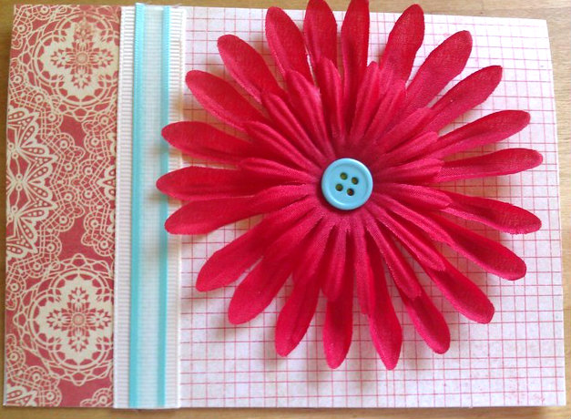
This is for another challenge from Splitcoast, last Friday's Free for All challenge, which called for using hot pink.  I don't have a whole lot of hot pink papers in my collection, but I did have a lovely multi colored one with these paisley shaped color splashes which I had never used because it is so busy, I wasn't sure what to do with it.  I decided to fussy cut a section out of it and attach it to a white card for contrast.  I added a Me and My Big Ideas dimensional flower sticker in complementary shades.  Not sure if the flower is exploding off colors, or streaming them behind like a comet.  It's a little weird, but I like it.  I thought the exuberant look of the "Celebrate!" stamp went well with the card, so I stamped it in orange.


This one is a ridiculously simple card, I am almost embarrassed to post it here.  It came about for Splitcoast's Tuesday color challenge, that called for a green/pink/brown combination, and I had just been fiddling around with some K&Co. die cuts and border stickers that I had gotten on clearance.  Since the colors worked, I combined them into a quick card using another sketch from my new book.  I used a white card as the base and layered on some brown, that I sanded on the edges and outlined with distress ink in walnut brown.  I also added some distress ink at the edge of the card.  I placed the border sticker on the brown paper and used foam dimensionals to pop up the bird die cut and the heart, which I had stamped in the walnut distress ink with the sentiment from A Muse Art Stamps.  Not only did this fit the color challenge, but it also works for both of Monday's challenges this week, Try a New Technique (distressing) and Clean And Simple (love themed card).  I was a little disappointed that the sanding distressing isn't more visible and I would probably try to do some more distressing if I had it to do over again, but I think it turned out okay.


Here is a bright happy birthday card I made using just Basic Grey papers and stickers from the Cupcake collection, which I bought a bunch of when it came out a few years ago.  I love it for birthday cards because it is so bright and festive.  I used a design from another recently purchased book, 175 Fresh Card Ideas by Kimber McGray.  The blue loopy border and the two presents are stickers from Basic Grey, the "It's my party" sticker is from Sticko.  The star brads are from Joann's.


Another birthday card.  Have you noticed that I am a little obsessed with orange lately?  It is just such a happy summery color, and it goes so well with aqua or sky or turquoise blue, which are also favorites of mine.  Here I used papers from Recollections Mosaic Memories pad for the background and orange strip.  The light blue solid cardstock is Bazzill so it has a nice subtle texture to it.  I used that to back the orange strip as well as the circle birthday greeting, and used light brown ink to set off the edges of both.  The circle and cake are from Stupendous! and since they are clear positionable stamps, you can change out the circle edges and the images in the centers of the circles, which makes for nice variety.  I finished off the card with some half pearls, which I had been coveting for a while but always found the stick-on ones at Michael's too expensive, and not enough in the colors and shapes I wanted.  I found an Etsy seller selling them in bags of 100 for the price of one sheet of stickers.  I have to use my own glue but it's worth it!


Another Father's Day card, this one made for the Featured stamper challenge on Splitcoast.  Each week one member is designated as the featured stamper, and we choose cards from her gallery to inspire cards of our own.  My card was inspired by this card by this week's Featured stamper, Susan Bridgman (Susanbri).  By changing the color scheme to more masculine colors I was able to make this a Father's Day card, though I kept the basic layout including the shape of the squares, the centered greeting, and the embossed edges.  To make the center element I punched a circle out of a scrap of designer paper (both papers on this card are more from the Mosaic Memories pad) and stamped the sentiment on it.  I layered it onto a white metal-edged tag from Staples, and mounted it with foam tape.  I used my new Martha Stewart scoring board for the edges and finished it all off with some navy blue eyelets in the corners.


This card was for two challenges:  the monthly Christmas card challenge and another card for the Featured Stamper challenge.  I made four of this card to fulfill half of my monthly goal of 8 Christmas/holiday cards.  I used this card by Susan as an inspiration, but the size of the image I was working with determined various changes that ended up wandering pretty far from Susan's original.  I finally got to use this gorgeous Christmas image from a set by Inkadinkado, which I stamped in red onto cream cardstock.  That was layered onto dark green plaid, which was layered with foam tape onto the front of the cream card, that I had covered with dark red plaid paper.  I ran a metallic gold ribbon across the bottom and stamped the sentiment (JudiKins) on another cream scrap, added green backing paper and a bit of foam tape to pop it up as well.  I kept the "doodads" to a minimum to make this a good card for mailing.

One last card, made last week:


This is my other card for the monthly goal, as I also made four of this one.  It was inspired by a torn tree design in a Cards magazine back issue.  I again used a cream card base and more paper from my ProvoCraft Christmas slab.  I layered red and dark green plaids onto the cream card, then tore a triangular tree shape from a different plaid paper.  I decorated the tree with various Christmas colored buttons, and stamped the sentiment (Studio G) in dark green ink onto a metal edged tag.  The tag is attached to the card with small gold brad (Making Memories).

Whew!  That was a lot of cards!  I still have a backlog of cards to load up and will try to do so this week.  But for now, I think I want to make a few more before I have to start preparing for my return to work tonight.

Have a great day, and thanks for looking!

Thursday, May 17, 2012

Going Old School

A couple of weeks back, there was a challenge on the Splitcoaststampers site to use old stuff--stamps, accessories, techniques--that you learned when first starting out stamping.  I had a great time with this challenge, it was a good excuse to dig down into my stuff and my memory and make cards the way I did when first starting out.  I got so into it I ended up making three cards for the challenge!


I pulled out an old Mary Jo McGraw book (my guru in those days) and made a card using a technique called "cracked tile".  The sun stamp is by Laurel Burch and was my first stamp purchase ever!  I stamped it in red and orange dye ink on a strip of kraft cardstock.  Then the tricky part--I covered the whole piece with clear embossing ink and clear powder and embossed it.  While it was still hot,  I sprinkled on another coat and heated again.  I have learned from trial and error (and blowing a lot of embossing powder around the house) that the best way to heat the layers after the first is from the bottom rather than across the top of the piece.

I added more powder and embossed twice more, and on one of the layers sprinkled in some gold glittery embossing powder, which becomes embedded in  the clear stuff as it melts and sinks in.  It's hard to see on the whole card but the picture did catch some of it in the upper left.  After doing several layers of embossing, I folded the piece up, which cracks the embossed layer and makes the "tile" design.  To make the tiles pop out a little, I rubbed brown ink over the whole thing, then wiped with a paper towel.  It comes off the embossed surface, but sticks to the paper in the cracks in the embossing.

To finish the card I layered onto some solid red cardstock and used an old corner punch to make notches, which I used to hold a frame of orange embroidery floss.  The whole thing is layered onto a kraft card.


The stamps used here are from some of my earliest Stampin' Up sets, purchased in 1997 or so.  I embossed the gecko (from the Southwest set) using verdigris powder on a white piece of cardstock.  Then I went to town with various inkpads in shades varying from yellow through dark brown, sponging the colors on to give the effect of a drawing on a cave wall.  I used deckle edge scissors to trim the edges and layered it onto a piece of dark red corrugated paper, which went onto a kraft card.  Finally I wrapped plain twine around the card several times and knotted it.  I finished it with some gold sealing wax, stamped with the swirl stamp from the Stampin' Up Celestial set.  My partner sent this card to her mom for Mother's Day, since her mom loves southwestern motifs.


Finally I made this card using a stamp from one of my favorite stamp companies back then, Acey Deucy.  They went out of business long ago but I was excited to see that some of their designs have been licensed through Stamp Diva.  Alas not this one, which is my favorite one.  I began by sponging purple ink onto a white card base and dragging the sponge to make streaks and lines for some texture.  Then I layered on a piece of torn mulberry paper (no plethora of scrapbook papers back then, we used art papers like mulberry and banana paper, and Japanese origami paper).

To make the main image I took chalk pastels (NOT oil pastels, this won't work) and scraped them with the blade of my Xacto knife to drop crumbs onto the piece of white card.  I started with the lightest colors of orange and yellow and worked from the inside out to blue and purple around the edges. I wanted to give the effect of dawn breaking or the sun coming out of clouds.  Then I stamped the image in embossing ink and embossed with Galaxy embossing powder, which is black with sparkly glitter in it (hard to see that in the picture).  I layered the stamped piece onto the card and finished it off by highlighting the star with gold glitter glue.

I love all the choices of materials and embellishments that we have now but it was fun to go old school for a day, and it was a great reminder to pull out some of  those old stamps that I still love!

Thanks for looking, and have a great day!

Wednesday, May 16, 2012

Mother's Day

I made a bunch of Mother's Day cards this year, a couple on commission, which was kind of a new thing for me.  Mother's Day is fun because I love making cards with flowers, butterflies, botanicals and fun patterns, and Mother's Day lends itself well to these things.  So...let's get started!


I love this card!  I based it on a design in a card magazine, turned the card into my own sketch, then back into a different card.  I like the blend of colors, patterns and textures, and the asymmetry of it, as my usual comfort zone tends toward the very symmetrical.

I started by stamping two flowers from Stampin' Up's Wow Flowers set, cut them out and crumpled them up, then flattened out again to give them texture.  I cut out leaves from a green denim paper, and punched some leaves from a darker green patterned paper (K&Co Edamame pad).  The yellow and green scalloped pieces came from the scrap box.  To make the card fit an envelope with the overhanging bits, I cut the card itself a bit narrower than the typical 4.25" width so that the parts that stick out bring it up to 4.25".  All of these were layered onto a panel of white cardstock, which was layered onto a kraft card.  I finished with some plain cream colored twine, a "file tab" with the sentiment (A Muse Stamps) and a butterfly in the upper right (also A Muse).  The file tab was created from a scrap and a corner rounder.

I had a request from a neighbor to make a card similar to this one for his wife for Mother's Day, and he added that she likes red.  This was the result:


I kept the overall pattern, the same flower shapes and the kraft card.  The very cool red background paper is from a Recollections pad.  I added more red in the strip of circles and scalloped piece, as well as the second flower (much redder than pink in real life) and used the same twine as before, turned into faux baker's twine with a sharpie marker!  Because I love the combination of red and aqua/turquoise, I couldn't resist adding the button and butterfly, along with the rhinestones (Martha Stewart) for contrast.  The card was finished with the stamped sentiment (Hampton Art Stamps).

While I was on the red and turquoise kick and playing with the leftover scraps from this card, I made this:


Haven't decided what to do with this card yet, so I left room for a greeting at the bottom right.  I used leftover pieces of the same red papers used in the card above, and layered an aqua blue ribbon on a cream colored ribbon to divide the patterns.  I went to my big box of deconstructed dollar store flowers for two sizes of daisies and stacked them, using a brad to hold them together and attach them to the card, and then covering the brad with a blue button.  A very simple card that makes me smile!

Back to Mother's Day...


This card came from just playing with some more of the K&Co. Edamame papers, that I am seriously in love with.  The colors go so well, and I have picked up some stickers and embellishments that coordinate with them for extra fun.  I went a little nuts with the corner rounder on this card, rounding all the corners of the card and background piece, then layering on a contrasting strip of orange pattern paper with some cream edge for contrast.  Finished with a big butterfly sticker and some letter stickers to spell out "Mom".  A quickie that one of our nearby friends snapped up for her mom.  Hope she liked it!


Another commission, made for a friend of Jan's on request.  All I had to go on was that her friend's mom likes "foofy", lots of florals and shabby chic and that sort of thing, so I went a little more over the top than I usually would.  I went back to the Edamame papers and embellishments.  I started by covering a cream colored card with the gray swirly background paper, and added a miniature doily (Martha Stewart) in the upper right corner.   I added a layer of brown and a scrap of that same orange paper for contrast (gray and orange is a color combo I have recently learned to love!) and added some dimensional stickers and a bit of a border piece.  My favorite additions on this card are the light tan piece, which is actually a piece of the packaging from the stickers, and the piece with the greeting on it, which came about as the result of a boo-boo.  I went to stamp the greeting on the tan piece and the stamp slipped, smearing it.  To cover it up I made another homemade "file tab" with my corner rounder.  The piece I grabbed to make it from happened to be the white strip at the top of the patterned paper that holds it into the paper pad, and the indentations along the top are from where it attached to the spine of the pad.  But I decided I liked the texture of it and decided to use it, and I love how it turned out!  Sometimes the best bits are from happy accidents like this.  I of course gathered up the rest of the paper edge strips and put them in my scrap box for future use!


Finally, the card I made for my own mom.  Yes, more Edamame papers.  I went neutral with this card, making a kraft card and layering tan and white patterned paper onto it, which I stamped with flourishes in brown ink and a pink butterfly.  The medallion was made using my Martha Stewart scoring board.  I have tried to make these without the board with sad results so I was very excited to get the board on sale and be able to make these!  I cut a strip of pink patterned paper and punched the whole edge with the Fiskars Threading Water border punch.  Then I used the scoring board to score every quarter inch and accordian folded the strip.  I brought the ends together and attached them, then pushed down the middle and ended up with a lovely embellishment.  I attached it to the card  and made the tag from a scrap of cream cardstock and finished off with a button for the center of the medallion/flower.  When Mom got it she asked if I had made the card, which I consider high praise!  Thanks Mom!   Glad you liked it!

Whew, so that was my Mother's Day card spree.  More (very soon) as I am still catching up on the blogging, I still have quite a backlog of cards to post here!

Thanks for looking, and have a great day!


Thursday, May 3, 2012

Even More Catching Up

I have had a lovely long "weekend" but return to work tonight.  I hope to get a little more crafting in before then, though!

Here are some more of the cards I made recently:


These are a couple of early Father's Day cards.  I used Maya Road's chipboard trees as a base, then covered them with various designer papers.  The wood grain paper is from K&Co.'s Edamame line.  All the other papers are from Basic Grey's Archaic line, which is just great for masculine cards!  After creating the backgrounds from various papers, I attached the tree top to the card, then the tree part to the tree top and added some foam tape under the bottom of the tree to keep it layered nicely.  I stamped the greeting on a scrap, glued it to the card and then topped it with the frame die cut, which was part of a set of them that I purchased on line years ago.  I added copper brads to finish off.


This is an early birthday card for my nephew, whose birthday is coming up in June.  He has a convenient 4-letter name, which worked out because I wanted to use a 4-circle sketch design from the Mojo Monday sketch challenge blog.  Here is the sketch:


This was a perfect design for an item I had been collecting for a while and wanted to figure out how to recycle on cards--the colored rings on Target pharmacy medicine bottles that indicate whose medicine is in each bottle (each family member has a different color).  I found that one of my circle punches makes a circle that fits perfectly inside the ring, and I punched four circles and added stickers to spell out Jake's name.  The card background paper is more of that fabulous Basic Grey Archaic paper.  The layers of red paper and striped paper both came from my scrap box and I don't know their origins.  On top of the striped paper I attached the circles with the letter stickers, and then glued the rings on top of them to "frame" them.  I really like how that turned out and I love using repurposed "trash" as card elements!

The final touch was stamping the sentiment on a scrap of orange paper and cutting the notches in the ends.  Trial and error on the correct length led to me having a leftover "banner", which led directly to the next card. I was thinking of a way to use the leftover piece and since the length was right on one side but not the other, I had the idea of making a "flag" from it by wrapping the "wrong" end around a toothpick.  I had a vague thought of using it as an embellishment on a cupcake image.

After making my "flag" however, I noticed that the toothpick was somewhat curved, and it made me think of  someone or something carrying the flag.  A dig in my embellishments produced a chipboard elephant from American Crafts, and from there I designed the rest of the card around the colors of the elephant and the flag:


The card base is light green Bazzill cardstock and the other papers are from the scrap box.  The blue circle is a scrap of cardstock, and I layered it onto a circle of Basic Grey "Cupcake" paper.  The paper has balloons all over it, but I like the abstract multicolored edge produced by showing just a little of it!  The yellow swirl paper is from a Provo Craft paper pad.

Both this card and the tree cards above were inspired by the same sketch from Splitcoast Stampers' Wednesday sketch challenge from April 18, 2012:


I love how one simple design can inspire a variety of cards!

Thanks for looking, and have a great day!

Tuesday, May 1, 2012

More Catching Up

I have been making cards pretty steadily, just not blogging them.  I have about two weeks' worth of cards to catch up on.  So without further ado, here are first few:


I originally intended this card as a birthday card.  However, some friends of ours who are also doing some backyard "farming" have decided to add a couple of beehives to their livestock, and I decided to give this card to them because they are so excited about their several thousand new tenants.  Stamps are all Hero Arts, burlap paper is from a DCWV slab, and the card is finished with some Making Memories brads and a bit of brown ribbon.  The tag was a premade gift tag from Target's post Christmas sales; the other side had a Christmas design on it but a lovely blank back side to use for anything at all!


This was a Clean and Simple sketch challenge.  I loved the chance to make a quick spring card and  this one took no time at all.  I don't have my long awaited Sizzix yet, the loopy background piece is a Martha Stewart doily.  The lavender and pink papers are two sides of the same piece of Crate Paper.  The center of the flower/doily was punched with a large circle punch.  The two butterflies are from the same mini-set of Recollections stamps.  I stamped the larger one in purple ink on a scrap of lighter purple paper and cut it out with an x-acto knife.  I folded up the wings for some dimensionality and added a tiny pink rhinestone to it, as well as three larger pink rhinestones on the lavender strip.  I stamped the greeting (Stampin' Up Mini Mates) and smaller butterfly in purple ink directly onto the brown kraft card.


I have also been working on going back through all the earlier Clean and Simple challenges on days when the current day's challenge isn't speaking to me.  This was the very first CAS challenge ever offered, in which we were supposed to look at Joanne's Fabric's line of Snuggle flannels and choose one to inspire a card of our own.  I chose a baby flannel that was printed with old-fashioned baby carriages.  For my card I again went to the scrap box for an old piece of blue background paper and a scrap of yellow.  I attached the plastic baby carriage (Dollar Tree cake decorations for baby showers) and drew faux stitches around it on the yellow square.  I added a Jessie James button from Michaels and stamped the greeting (AMuse stamps).  Now that I have a scoring board, I have become addicted to the side-folded 4.25x5.5" card!


I had three more cards left over from March's quota for my Christmas card goal of 8 cards per month.  My baby card design in turn inspired me to make up a quick CAS Christmas card design and to use some older items from my stash at the same time.  I made more of the side-folded cards and attached a square of red cardstock.  I had a 3-pack of metal plates from Making Memories which thankfully had adhesive on the backs.  I have some that pre-date the adhesive backs and get quite high from superglue fumes when I use them!

The horizontal border is actually a sticker from Flair Designs.  Two scrapbook-page border strips yielded enough for the three cards, and I added the stamped greeting to finish the cards.  All three took about an hour to do all together, so this is a good design for making cards in quantity.

Have a great day, and thanks for looking!