Tuesday, January 24, 2012

A Day Ahead of Schedule...

Two quick cards today, both based on this week's Clean And Simple (CAS) challenge, which was to use the colors pink, white, and celery green on a clean-and-simple style card.

The first card came together in a flash, because I had an "outtake" of my color blocked card from last week's CAS challenge sitting on my desk, and it had pink and green color blocks.  I again stamped the dress form and sentiment that I used on my other recent card, added some pink and green background paper and layered all onto a white card.  Bazinga!


I dug into my drawer of paper scraps for the next card and found some delicate looking striped and floral paper in white (well, cream), celery and pink.  They looked a little lonely floating on the big white card so I added another layer of a celery green paper that has a subtle texture design, which made the prints work better.  Keeping it simple, I stamped the text with a Michael's dollar bin stamp using Colorbox pink pigment and embossed with clear powder.  It made the image show up much better and even "pop" a little.  I layered the sentiment onto a slightly darker green scrap, and finished off with a dollar store flower held together with a Making Memories pink flower brad.


Pretty happy with the end results of both cards, and it always feels good to use up scraps and "out-takes"!
Thanks for looking!

Monday, January 23, 2012

More Challenges!

I am continuing to be inspired and motivated by the challenges that appear daily on Splitcoaststampers.  Yesterday I took on the Featured Stamper challenge.  This is where one member of Splitcoaststampers is named the "Featured Stamper" for the week, and the challenge is to view that person's gallery and pick a card to use as an inspiration for your card.  Unlike some of the challenges, the connection to the inspiration has to be pretty strong because you are supposed to describe exactly what you changed from the Featured Stamper's card onto your own.

This week's Featured Stamper is Kim Hahn, AKA Luv Flowers.  She has posted over 900 creations on the site!  It took me awhile to figure out which card I wanted to use as my inspiration but I enjoyed going through the gallery while I was deciding.

This is the card I made:


I used the same basic structure as my inspiration card, but substituted a different color scheme and used a flower sticker rather than a stamp.  The "stitches" around the sticker are actually rub-ons (Doodlebug Designs).  I got to hit the stash for several stickers that I had been wanting to use:  the flower sticker is a "Softly Spoken" design from Me and My Big Ideas; the definition sticker is from Making Memories, and the small chipboard button and heart are from Crate Paper.  The background paper is from Basic Grey's Cupcake line.  I love the paper that looks like cookie or icing sprinkles.

This card is also a birthday card for our niece who turns 17 (ack!  it seems like only yesterday she was a toddler jumping on the bed to wake me up!) this week, and who is definitely a "Delight"!

A second card came together from one of those serendipitous moments when several pieces of paper or embellishment end up in a pile together and show a combination that I never would have thought of on my own:


 In this case, a scrap of gold-foiled Valentine's Day paper from Sandy Lion ended up on top of sheets of red and blue background paper from that Basic Grey Cupcake pad.  Dark red with tomato red?  Blue on a Valentine's Day card?  But I kept looking at it and playing with it and decided I really liked it.  Then I realized the piece of Valentine paper didn't need any further addition of sentiments as the paper happened to have been cut in a way that put "Love Thinking of You" right in the center of the piece.  I added three metallic gold paper hearts from Jolee's, popped up on mounting tape, and called it done.  I especially like that one heart forming an end to the spiral of gold foiling on the paper.  Super easy card that looks like it took more effort than it did--gotta love those!

Thanks for looking and have a great day!

Saturday, January 21, 2012

Clean and Simple and Inspiration Challenges

My most recent cards were inspired by challenges over on Splitcoaststampers.  Yesterday was the "Clean and Simple" (referring to design style) challenge.  We were challenged to use a card by Loll Thompson as a sketch/inspiration for making a color-blocked background.  Here is Loll's card:


And here are the two I made:


The first used a stamp by SavvyStamps as the background.  I stamped it 3 times in light rose ink, then stamped the Inkadinkado dress form over it in brown, and finished with the word stamp, also from Inkadinkado.

I layered this onto a piece of brown cardstock and punched the corners, then used mounting tape to layer it on top of some of the pink and pink and brown plaid pattern papers I have been using like crazy lately.  I really had to remind myself that the idea is to be "clean and simple" and hold off on adding more and more embellishments.  It looked a little unfinished to me at first, but has grown on me until I really like it!

For the second card I experimented with sponging ink through a stencil to form my background.  I initially had a vague idea of some sort of tiki/fruity drink theme inspired by the stencil shape, but realized that the color went perfectly with a Christmas sticker I had and hadn't been able to figure out anything to do with, so it became a Christmas card!  I applied the sticker over the background, layered that onto some green cardstock and added light green eyelets at the corner.  It didn't look quite right alone on the card, so I went back into my scrap drawer and found some blue cardstock that complemented the blues and greens from the sticker perfectly, and really set the card off.   I will be revisiting the CAS challenges soon, I really liked having to pare down a bit and make a simpler card.

Today I tried the Inspiration challenge.  Every Saturday the challenge moderator posts a website with some kind of art or design elements, and the challenge is to pick something on the site as an inspiration and make a card based on it.  It's very open, so you can make a card using a similar color scheme, or design shape, or anything reflecting some aspect of the inspiration piece.

Today's inspiration site is Land of Nod, which is a subsidiary of Crate and Barrel specializing in decor and items for babies' and kids' rooms.   I found so much inspiration it was very difficult to narrow it down!  But this pull toy caught my eye:


and reminded me that I have had a sheet of stickers featuring pull toys for ages that I have been meaning to make a baby card with.  Today was the day!


The stickers are from Frances Meyer.  I stuck them to card stock and used an X-acto knife to cut them out so they had a little more sturdiness to them.  Since they are pretty large, I decided to go with a 7.5" by 4.25" inch long card.  I layered dotted patterned paper onto the card, then added the striped paper, layered onto plain yellow cardstock for some contrast.  Finally I used mounting tape to stick the three pull toy stickers on, which gave the card some dimension while making a place for me to stick the purple fiber that connects the three toys into a little baby-welcoming parade.  I finished it off with the sentiment, also from Savvystamps.  So glad I finally used these stickers!

Thanks for looking, and have a great weekend!

Wednesday, January 18, 2012

Card Patterns #148 Purple Valentine

I frequently find card inspirations from something that doesn't turn out quite right.  I will make a background or focal piece or embellishment for a card and end up setting it aside, and when I rediscover it, it will inspire a card of its own to better suit it.

That's what happened in this case.  I stamped the Rubber Stampede heart in Adirondack eggplant ink, and added some bluish-purple glitter glue.  Once it all dried, it didn't seem right for the card I was working on (though in the end, nothing turned out well on that card, as you can see in yesterday's entry).  So I set it aside and when I came to putter at my table this morning, it had ended up on a partial sheet of purple background paper that went well with it.  But that was all I had, not enough for a complete card yet.

Searching for inspiration, I came across the CardPatterns blog and its most recent sketch challenge, Sketch 148.  The purple background paper was perfect for the 4-strip background, and cutting it apart with another layer underneath broke up the monotony of the background alone.  I ended up not following the sketch precisely because the rest of the embellishments didn't quite work for my design (putting the flower by the heart kept looking like a barette or flower behind the ear somehow).  But I loved the sketch and loved having my unloved little glittery heart from yesterday's session get redeemed on its own card that fits so much better:


As mentioned, the stamped image is Rubber Stampede.  I think this is the first heart-shaped stamp I ever bought and it still seems to be my go-to Valentine's image!  I don't know the origins of the various papers in the layers except for the bottom piece, which is a watercolor-look floral from Keeping Memories Alive/Simple Expressions.  While it made a good background here, I will have to find a way to put this gorgeous paper front and center on another card soon!

The trim (Trimtex) came from the aisle in Hobby Lobby where they sell the paints and bling for customizing t-shirts and bags and the like.  If I look hard enough, I can find something for my paper addiction in any aisle of the craft store!  I was excited to find a use for this as it was one of those clearance sale finds that has languished in my stash for several years.

The banner is from K & Company from the current Valentine's collection.  The brad is Making Memories, and the flower is from a deconstructed dollar store flower.

I recently returned to morning watch (the overnight shift from midnight to 8 AM) on my "day job" and was worried that it would get in the way of this project, but unwinding after work with a little mesing around at the craft table works as well at 9 AM as it does at 5 PM, thank goodness!

Tuesday, January 17, 2012

Some Days...

I have a friend who swears she cannot bake bread when it is her time of the month.  It just doesn't work.  I am wondering if that same rule applies to card making, cuz check this out:


After taking forever to get something going and several false starts (usually this would be where I would give up on paper crafting for the day and go do something else) I finally produced this hot mess.  There was an okay idea under there at one point.  But everything went crooked, the heart eyelet messed up the flower and then when I put the flower together elsewhere on the card with a smaller eyelet, it still didn't look right.

My sweetie suggested that I put it aside and come back to it later and maybe I will see something I can tweak to make it work better.  So it's been sitting.  I still want to set it on fire.

Fortunately I kept at it and things improved, and here are three more cards I made, bringing me again up to date.  I don't think I will burn these but I am not in love with them either.  I need to remember this next month and get a few days ahead when the time comes!


This one is for my sweetie.  I found some music background paper and the line just came into my head.  I like to handwrite the messages on cards for her.  The stamp is Rubber Stampede, stamped twice with red Vivid dye ink. I finished off with a copper spiral clip.  A true 10-minute card.


A variation on the card using the same kraft cardstock and music patterned paper (7Gypsies).  This time I added a layer of red starburst vellum underneath, and cut out a heart from the same paper, which I popped up with some mounting tape.  Another spiral clip to decorate the edge, this one pewter, and finished off with old fashioned typewriter key stickers from Sticko.  Another super fast card with no stamping involved.


Finally another card  that had me beating my head on the wall for a while before I finally finished it.  The papers came from my scrap drawer.  I believe the striped one is Provo Craft but I am not sure about the origin of the text paper.  I layered the text paper onto a 5x7 white card and then layered the striped paper onto a square of raspberry textured paper.  I punched three circles from a black scrap and used the "I" and "U" stickers from a partially used sheet of alphabet stickers.  The gem heart is from a gem assortment from the Target Dollar Spot this year, and is the only recently purchased element on the card.  I used mounting tape to pop up the three circles and added them to the striped panel.  I finished off the panel with some black and white checked ribbon and a double spiral clip, and layered the panel onto the text paper with more mounting tape.  I love the ribbon/clip embellishment and finding my box of clips made me remind myself to use more of them in the future!

Hoping I can get out of my card making mini-funk, but I am pleased that I was able to persist instead of giving up.

Friday, January 13, 2012

Catch Up Day

I knew this would start to happen as work picked up again.  I have fallen behind several days.  But fear not, we are about to catch up!

For January 11th, I attempted a true 10-minute card using leftovers from Deb's birthday card:


That plaid paper should look familiar by now--don't worry, I'm giving it a bit of a rest after this.  The crackle paper background is of unknown origin, probably a DCWV slab.  The plaid paper and flower are both Imagination Project/Chloe's Closet.  I used a circle punch on the flower and layered it onto another upcycled Target Christmas gift tag,  and layered it onto the card with mounting tape.

The stamp is from Stampin' Up's "Wow Flowers" set.  I cut the banner/fishtail shape by hand, just eyeballing it.  Then added bronze colored brads, most likely from Making Memories.

It did take just ten minutes!

For January 12, another Valentine.  I used a card in an issue of Take Ten magazine (Spring 2006) as a template (upper right):


Here's my take on it:


The red background paper is actually from a Christmas assortment, and I cut the half circle out of more of that foiled Valentine's paper.  The heart focal point is a sticker, and I added some gold metallic ribbon from Michael's.  Super easy!

Finally, today's card is one more Christmas card for my January SCS challenge:


While I was making cards this year I tried one of those "one sheet" techniques, stamping a Stampin' Up snowflake repeatedly all over a sheet of 8.5" x 11" cardstock using lighter and darker shades from my Blue Breeze Kaleidacolor pad, plus some Versamark ink that I heat embossed with Judikins psychedelic EP.  The latter doesn't show up well in the photo but it is glittery and sort of iridescent/color changing as you look at it from different angles.

I used some of my sheet on Christmas cards but had a bit left over.  I layered it onto dark blue cardstock, and then onto some really pretty blue paper that is printed to look like it was crumpled and smoothed out.  This was one of those pieces I have been "saving" that I decided to make myself use, and I love the way it looks here!

The snowflake sticker is from Michael's Reminiscences line, and the tag is a premade one of unknown origin.  My favorite thing on this card is the "brads" in the corners.  They are actually the centers of several of the snowflake stickers which pop out from the snowflakes themselves and could be considered scrap/waste from the stickers (though I think most of us would use them for something like this!)

Hope everyone has a great weekend!

Tuesday, January 10, 2012

Another Christmas card for next December

Confession:  Today's card, and yesterday's, were made several days ago.  I knew once I got back to work there would be days like this, days when I work late and am too tired to do much creative in an evening.   Going forward my plan is to make extras on days when I have those creative bursts, and also plan some activities, like coloring images for use later, that I can do on autopilot.  After all, there is a new season of Downton Abbey just started up!

Anyway, today's card is another one for the January CCC goal of eight cards.  This one makes six so far, woot!
Here it is:


You can see that the cool blue retro snowflake paper is down to tinier and tinier pieces, but I love that design so I'm determined to use every bit of it!  I actually made several of this card but used most of them as New Years cards to finish up 2011's holiday cards, so I won't count them toward the challenge.

The base card is kind of a blue/gray speckle of unknown origin.  The stripe and snowflake papers are from a DCWV Christmas paper pad from several years ago.

The real origin of this card was the desire to blow the dust off the old resistance technique, where you stamp and emboss an image, then brayer the background in various ink colors, then wipe the wet ink off the embossed image, leaving it to *POP* against the background.  In this case I used a Blue Breeze Kaleidacolor ink pad which had 5 shades of blue.  I didn't want the clear lines between colors showing up so I did a lot of brayering and then finished everything off with a layer of light blue chalk ink to blend all the colors together.  I really like how it all turned out.  I did one big sheet with five of the stamped images embossed in white powder and brayered and blended all of it before cutting it all apart for the separate cards.  It was a lot of fun working out exactly how to get the effect I could see in my head.

The stamp is from Stampendous and it is one that I discovered while digging through a separate box of just Christmas and Chanukah stamps.  I had never used it!  So I guess this will count for the S2S challenge as well (really need to figure out the whole ledger aspect of this challenge if I am going to keep making cards for it...!)

Although, as you can tell from my other cards, I often like to go monochromatic or with a fairly strict color combination, I found myself wanting a little contrast to finish off these cards.  That's where my Jolee pengin stickers came in!  I love the unexpected "HI THERE!" of the green or pink-clad penguin wandering through the bottom of my otherwise sort of classy card.  This design was a card for the close family members, can't get too high-falutin' there!

Here's hoping I get out of work quickly tomorrow and have a chance to do a little puttering around after I get home.

Monday, January 9, 2012

Very Pink Birthday Card

Today is my dear friend Deb's birthday, and I made her a card featuring one of her favorite colors, pink:


The images are Maya Road chipboard from their Trees set, covered with various patterned papers.  I don't know the origin of the tan on the trunk of the tree, but the bird is wearing more of the Imagination Project/Chloe's Closet plaid that I used in yesterday's card as well.  The "ground" is Simple Expressions and the tree foliage is some Heidi Grace paper that I absolutely love.

The "Happy Birthday" stamp is one of the oldest ones I have, from the long-gone stamp company Darcie's Country Folk.  You probably could have guessed the early 90s vintage from the font...

Other than some fussy X-acto knife trimming on the chipboard, this is a card that goes together really quickly!  

Oh...and Deb seemed to like it so I would call this one a definite card success.

Sunday, January 8, 2012

My Favorite Things Stamp Club Challenge Sketch #52

I found inspiration for this card in the final 2011 card sketch from the My Favorite Things Stamp Club Challenge.  Too late for the contest (and I don't have any MFT stamps--YET.  This will be remedied one day soon!), but the sketch led me to this card:


I had to tweak the design a little bit to fit the image I was working with, but I like the way it turned out.  I had started with everything being very light and delicate, using chalk to color the image, and stamping with a lighter brown color.  But when it came time to add the flower, the light pink and cream colored ones looked a little meh.  So I decided to try the lavender and liked it better now that something is more "in your face" in this design.

The background text stamp is Hero Arts, and the Forget me Not heart collage stamp is Stampington.  (Ha!  I just noticed that with the flower as it is, it reads "forget me" instead of "forget me not".  A passive-aggressive breakup Valentine?)

The ink is my beloved, slowly running out of ink Marvy Matchable in medium brown.  We have been through so much together; this pad permanently resides in my wheelie crop bag because it always goes with me.  I wish there was a refill for it!

Not sure of the origin of the crackle paper, but the plaid paper is from Imagination Project/Chloe's Closet and it's a piece I have been hoarding because it is so pretty and I only have one sheet of it.  But one of my New Year's Resolutions is to USE my supplies instead of saving them for some mythical "really special" card.  I figure if I am making a card with paper I really love, it becomes by definition a really special card.  Right?

I think the brad and eyelets are probably Making Memories.  The flower is from a spray from the dollar store--a few years ago when Prima was first all the rage I went to the dollar store and bought about $10 worth of flowers in all colors and took them apart.  I have barely made a dent in them.  I will probably never have to buy flowers again!

Saturday, January 7, 2012

Catching up on the first six days of my challenge

I started off the year with my table still covered with Christmas papers, stamps and supplies, so decided to knock out some Christmas cards to put away for next year, and some non-holiday-specific snow cards as well.

For January 1, 2012:


The design is based on a "Tempting Template" challenge from a Stamper's Sampler Take Ten issue.  The center image is a Karen Foster sticker, layered on red paper and popped up with mounting tape, and embellished with an eyelet and ribbon.

For January 2, I continued with the same template, turned sideways:


Stamp is a very old one from long-defunct Appalachian Art Stamps.  I had made a bunch of holiday/New Year cards with the stripped and snowflake paper so part of what I was trying to do here was use up scraps.
I like this card a lot.

January 3 and January 4, I continued with using up those scraps.  The focal images on both are upcycled gift tags from Target (yay, day after Christmas clearance sale!) for quick and easy cards.  I found my eyelet setter kit AND a bunch of eyelets so I went old school with these.


On January 5th, I went back to some traditional Christmas colors:


The wreath is from A Muse Art Stamps.

And finally, on January 6, I moved away from the Christmas cards to an all occasion "hello" card.  I had two challenges here.  The card came about as a way to use up those little flower stickers, which had gotten loose and were all over one of my embellishment drawers.  After I gathered them up I decided to use them and get them out before they could roam again.  And also, I had recently read or overheard someone saying that they had been obsessed with navy blue and red as a color combination lately, so I decided to combine my red flowers with some navy blue.  Another very quick and easy card.


So my challenge is begun!  Stay tuned and we'll all find out if I can keep this going!

Starting off Right

So I guess I should start by introducing myself.  I'm Colleen, I am 45 (ack, how did THAT happen?) and happily partnered for going on 17 years with my girlfriend Jan.  No kids, three dogs, several chickens and a rooster.

Back in 1996 when I wanted to do something artistic but lacked any ability to draw, I found out about rubber stamping.  Been doing it off and on ever since.

Last year was decidedly off, for a number of reasons, but I think the main one is a bout of depression.  I'm better now, more often having the gray moods in between the blue sky days instead of the opposite.  One thing I did for myself after the holiday season at work was take the first week of January off and have a "staycation".  I had a long list of things I wanted to do, fun excursion type things and household chore/organization type things, but instead, I dove into cardmaking and really enjoyed it.  It has been a fabulous week and I have a bunch of cards to show for it.

One of my New Year's resolutions every year is something like "make art every day" or "do something creative daily".   I have often thought of challenging myself to make a card a day for the entire year, just to see if I could do it.

Since this year has started off so promisingly in the "create every day" respect, I am going to go for it.  I probably won't make something every day, but I challenge myself to post a (recently created, by me) card here every day.  That should at least get me making a batch or two of cards every week, and posting and writing about them daily.

So to start off, here is a card I made today:


It is based on the current card sketch challenge for this week over at Splitcoaststampers.  Splitcoaststampers is a huge community of papercrafters who post hundreds of photos daily of cards and other items that they have made.  I have lurked there for a long time looking at other people's work and am just starting to participate.  In fact the cards I post here will be the first ones I've posted there.

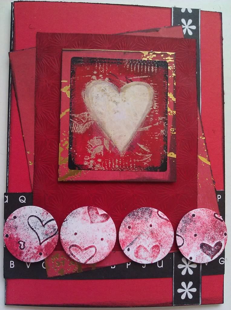
So anyway, I call this card a Grunge Valentine.  There are actually no stamps used, just a lot of ink!  I layered plain red paper onto a premade white card (4.25" x 5.5", which all of my cards will be unless otherwise noted).  The black and white pieces of paper came from a Die Cuts with a View paper pad I have had for several years, but I have no idea which one at this point.  The red patterned paper is foiled and is a scrap of unknown origin from probably 2007 or 2008 or so.  I layered that over the black and white strips, then added a piece of textured red vellum (again, no idea of the origin, I promise to keep better track of these things as I add new supplies!).  The main image is a SandyLion sticker and is layered onto more of the red foiled paper, and attached with mounting tape to pop it up a bit.

I tried several different things for the circles and none of them were working out.  Finally I tried taking a piece of bright white embossed cardstock and inking it with first red and then dabbed with black Vivid ink pads.  This both toned down the brightness of the white paper and helped the colors match the rest of the card.  I punched 4 circles out of the inked card and attached them with foam mounting tape as well.  And...done.  My first Valentine's Day card of 2012!

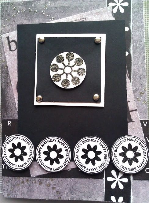
I was having fun with the sketch, and a set of newly purchased Stampin' Up stamps (Wow Flowers, a retired set bought on Ebay) arrived in the mail this afternoon, so I broke them out immediately and made another card.  This time I dug into my paper pile and challenged myself to use some of the "why did I buy this?" papers from clearance sale binges, and also to go for some bling, which is not usually my thing.  Here is the result:


It is hard to see but the background paper has glittery dot circles on it.  The main image is embossed with black opal powder and the four smaller flowers with detail black powder.  And I just realized I took the photo before I added the final touch, which was some Martha Stewart clear rhinestones as the flower centers!  So the real thing is a little blingier than this!

Next entry--I'll post my cards for the first six days of the year.