Friday, June 8, 2012

Celery Pool Party Delight

This week's color challenge was to use the colors Celery, Pool Party, and Daffodil Delight.  Since I don't have official Stampin' Up cardstock and papers, this translates to medium green, light blue and yellow.  I thought the theme lent itself well to a baby card, and came up with this:


I started with a sage green card base and layered papers from a baby-themed American Craft pad.  I cut out a circle (my sophisticated circle cutter: take card-in-progress to kitchen and try various bowls and containers face down on it til I find the right sized circle shape, then trace the edge of that container on my designer paper and cut out with scissors!).  I attached the circle shape to the card.  I inked the edges of the card and each layer of paper with light green ink before gluing them in place.

I cut a strip of light blue cardstock and inked the edges, then stamped the sentiment (Stampin' Up Mini Mates) in the same ink.  I attached the strip to the card and ran a yellow sheer ribbon under it.  I took a metal circle tag and put a light blue brad in the hole, and added a sheep sticker that matched my colors perfectly.  I finished off with a button in each of the three colors.  It doesn't exactly match the colors of the theme for the day, but it is a reasonable approximation.

I wanted to make another card with the same colors, so I turned to my scraps collection and came up with this:


I chose various scraps in coordinating colors, mostly from the Recollections and Basic Grey Archaic lines.  I punched out circles in three sizes, inked the edges with dark olive ink and played with them on the card until I had an arrangement I liked, and attached them.  For the centerpiece I made a paper rosette and attached it, topping it with another button.  I stamped the greeting (Stampin' Up Wow Flowers) on a scrap of sage green paper and snipped it out, planning to use the corner rounder on it.  But when it fell onto the card I liked the contrast of the angles and circles, so I left it as is.  What do you think?

Thanks for looking, and have a great weekend!

Thursday, June 7, 2012

A Banner Day

I am taking a break from the massive catch up posting, so will spread the last few days' cards over a couple of entries, along with (hopefully) the daily cards I continue to make.

Before I do today's cards, though, I want to note one milestone:  I have passed 1000 pageviews!  Since I do relatively little to promote this blog, I am very excited about this.  I started the blog basically as a way to keep track of my goal, and to have something to show for it when I finish the year.

Today's cards are for the Thursday Ways to Use It challenge at Splitcoast Stampers.  The theme for today is banners.


I actually made this card several days ago, so I didn't officially submit it for the challenge.  It is based on a sketch in my new Sketches for Papercrafters book, which has been very inspiring.  For this card, I made a 5"x5" card from white cardstock, then cut one-inch strips of designer paper (all from Basic Grey Cupcake collection) and trimmed them into banners.  I attached them to the card and decorated each with a coordinating button.  I layered an aqua blue ribbon onto a cream colored one across the top of the card, and attached a layered flower (Michael's dollar bins!) with an aqua button center.  Finally I stamped the greeting (Studio G--Michael's dollar bins again!) in orange ink at the bottom.

For today's challenge, I CASEd my own card and made a Father's Day version:


This time I used coordinating papers from Authentique (Loyalty line) and left out the flower!  The sentiment is from Stampendous.

Making this card left me with a strip of 3.5" x 11" cream cardstock, and 2" strips of each of the banner pieces, so I decided to make a coordinating gift card holder:


(The colors of both came out truer in this photo, by the way.)  I cut the strip of paper down to 10", to make a 5" card when folded, so that 5 1-inch squares would fit perfectly across.  I cut the 2" strips into 1" squares and played with them til I had a good pattern.  I had to cheat a little and use the flip sides of the double-sided paper so there are a couple of pieces that don't show in the original design.  I measured the center of the card and drew light pencil guidelines 1" to each side, then added strips of roll-on adhesive and attached my squares, keeping the line straight and even.  I stamped the greeting, this time in denim blue, and finished off with ribbon and buttons that match the big card.

Finally, one more birthday banner card:


This is a variation on the card I recently made for my brother's birthday, again using the Basic Grey Cupcake papers, both because I am ready to use them up, and because they are so perfect for birthday cards!

I made this card on kraft cardstock and punched the right edge of the card front into a scalloped border, then punched a scrap of paper with the same punch and lined it up on top.  I added a wide strip of the red swirl paper and a yellow ribbon between.  To make the cupcake I again used my Dollar Tree stencil set and cut out a wrapper piece and the icing.  I attached the wrapper to the card.  Then I used the banner stencil that was part of the set to make the "happy birthday" banner.  I had to adjust it to be a little longer, then cut it out and stamped the sentiment (A Muse Art Stamps) on it.  I should mention that I made it on a folded piece of paper, so that I could put a line of glue down the fold and wrap it around a toothpick.  When it was dry, I made a small slit in the icing piece and put the banner toothpick through it.  I added foam tape to the back to hold it in place, then several more pieces to give dimension to the icing.  To make the cupcake stand out a little, I lined the edges with a black thin Sharpie.

So that was my banner day!  I hope you have a banner day as well, and thanks for looking!

Wednesday, June 6, 2012

Birthday Cards

One last massive catch up post from cards made in previous weeks, then a post to catch up the last two days' production, and I will be really, truly caught up.  YOWZA!

I've been in a birthday card making mood so this post features birthday cards I have made in the last couple of weeks, starting with two I made for family members.

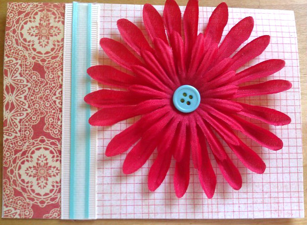
My sister's birthday was way back on May 1st, and I made this card for her:


I can't remember exactly where I found this design but I was using a card from a magazine as a sketch.  I used a bunch of scraps from my Basic Grey Cupcake papers, still my go-to for birthday cards.  I covered a white card with the orange background paper and lightly drew a line like faux stitching around the edge, then added the strips of various papers and outlined them too.  Then I inked up the largest flower from Petal Pizzazz (Stampin' Up) by inking it first in orange and then dragging each edge through the red pad to give it a two tone look.  If you are doing this, remember to do the light color first and then the darker color because it is less likely to muddy up the inkpad.

After stamping the flower I cut it out and mounted it with foam tape.  Then I stamped the small round Happy Birthday stamp from Wow Flowers (also Stampin' Up) and used a circle punch to punch it out, and mounted it on foam tape at the center of the flower.

My brother Mike's birthday was May 4, and this was his card:


This card took a while longer.  I had some various red and blue papers (unknown source) that all seemed to go together nicely.  I started by layering the striped piece on a white card, and adding a strip of red dotted paper across it.  To make the cupcake, I traced a cupcake wrapper stencil on the same paper and cut it out, then traced the stencil for the icing on a coordinating blue scrap and cut it.  I glued them together and punched a small red circle out of a scrap for a cherry.  I attached the cupcake pieces to a rectangle of white cardstock, and used a dimensional dot to add the cherry.  Then I stamped the greeting (Stampendous) under the cupcake.  I colored all the edges with a red inkpad, and layered it on a piece of red and white patterned paper that coordinated well.  I am getting more comfortable with adding pattern to pattern without separating them with solids!  The cherry was a little blah, so I added some glitter glue to it.

While that dried, I made homemade "baker's twine" with plain twine and a red sharpie. I have a large clear plastic quilting ruler that is about 6" across.  I covered it with saran wrap to keep it clean, then wrapped plain twine around the ruler nice and tight for about 15-20 loops.  Then I drew stripes across the lined up twine using the red sharpie.  I did one side, then flipped the ruler and did the other.  When I unwound it, I had my own "baker's twine"!  I still want the real thing, but this will do til I get some!  I wound the twine around the focal piece a few times and tied it off in a simple bow.  Then I mounted the layered pieces onto the rest of the card.

The other birthday cards are just cards for my stash at this point, none of them have found a home yet.


I made these two cards while playing with a set of retired Stampin' Up stamps (Alphabet Soup).  I like these because the words become the main image and all I have to do is add some papers and embellish!  On the first card, I was trying a new technique for the Monday challenge where you are supposed to dry emboss a pattern onto paper (using a Cuttlebug, Sizzix, etc.) and then ink the reverse side, producing a negative where the parts that are popped up on the front side are white and stand out from the inked part.  Not having a machine, I took some embossed designer paper that I have, where the front is covered with embossed stars, and cut a strip off and tried inking it up.  I think the embossing is a little shallower than you get with the Sizzix, etc. because there wasn't much contrast.  But I decided to still use it on a card.

I covered a card with denim designer paper from Elizabeth Ann, then added the star embossed strip across it.  I stamped the sentiment in denim blue Adirondack ink on a white square, and layered it onto a scrap of green denim paper.  I attached that and a diecut from K&Co using foam tape, and was done!

The other card was made for the Tuesday color challenge that week, which was to use orange, light blue and navy blue on a card.  Since I lovelovelove orange and blue combinations, this was right in my wheelhouse!  I made the base card from light blue Bazzill cardstock and layered on a sheet of faux ledger paper that had orange lines on it, then layered two contrasting pieces together into a stripe.  I cut a square from another piece of plain orange paper and used that to highlight the white cardstock on which I had stamped the sentiment.  Then I layered that on a delicious bit of orange and blue patterned paper.  All the papers are from the Recollections Mosaic Memories pad.

I wanted to finish off with a line of orange flowers but did not have any orange flowers in my assortment of deconstructed dollar store flower sprays.  But I did have some white ones of the right size, and an orange inkpad, so I very quickly dyed them orange by pressing them on the pad.  The only hitch is that they took a long time to dry so I had orange fingers from checking them too often.  I finally had to leave them overnight.  The next day I attached them to the card with black brads and it was finally finished.


 This was from a challenge to use vellum on a card.  I took some lightweight white vellum and stamped a flower from the Stampin Up Petal Pizzazz set in orange and pink ink.  Then I took a stylus and outlined the white sections of each image, presseing down on it to make it pop up on the reverse side (use a piece of fun foam or an old mouse pad underneath to cushion the paper while you trace).  To make the card I took a plain white card and embossed a simple frame by tracing a line around it using my Martha Stewart scoring board.  Then I used a scrap of designer paper to make a "vase" and attached the vellum flowers with brads, and finished the card off by stamping the sentiment (A Muse Stamps) in the lower right corner.  I really like how this card turned out!


Finally, two quick and easy cards, that work either for birthday, graduation, or general congratulations.  I layered the red graphic design paper onto a white card, then cut another scrap of the denim paper from the card above to fit.  I used pinking paper edgers to cut the edge and attached it over the red.  I stamped the star image using a foam chunky stamp and denim Adirondack ink, and cut it out.  I stamped the sentiment (Denami Designs) in Frost White Colorbox ink, and heat embossed with white embossing powder.  Then I mounted the star image on foam tape, and finished it off with a button in the center of the star.

Here's is another variation using the same stamp:


For this card I layered designer paper (unknown source) onto a light blue card.  There was a bit that said "Rock Star" so I cut out the "Rock" and layered it onto a scrap of the blue cardstock.  Then I stamped the chunky foam star in yellow ink and cut it out, then covered the star with clear glitter glue and let it dry.  To make the letter I stamped the letter "U" from a set of alphabet foam stamps on the back of a piece of sky blue glitter paper and cut it out (this trick only works on letters that don't have a backwards and forwards, since you are cutting it from the reverse side).  I glued the letter in the middle of the star and added the "Rock" piece next to it. 

Whew!  Tomorrow I will catch up on all the cards I made yesterday and today!

Have a great day, and thanks for looking!

Monday, June 4, 2012

Today So Far...

As promised/threatened, here is another post for today.  I want to show off the two cards I have made so far today!  I'm pretty pleased with both.

First is a card I made to undertake two different Monday challenges: the Clean and Simple challenge, which called for using letters in our cards; and the Try a New Technique challenge.  The Try a New Technique challenge had an option of doing two different things, picking one or the other or using both.  I picked "the other."  This is the "see through image"--basically an image is stamped and then a shape is cut out around it so that the stamped image touches the sides of the frame but the rest is cut away.  I chose to use the combined challenges to make my second Christmas/holiday card for June:


I started with a plain white card and cut a piece of Fancy Pants designer paper to fit, leaving a 1/8" or so border.  I found a square stamp in my collection with a wood mount the right size to make a window around my image and traced it in light pencil, then stamped the ornaments image (Imaginisce) in light green ink.  Next I took my Xacto knife and cut out the square, going around the ornaments so that they "hang" from the top edge.  I cut a square of light green paper just a bit larger than the window and attached it to the white card, then used foam tape to mount the pink designer paper on top of it.  I added the letter stickers to spell out "joy" at the bottom.  Finally I decided that it was a little plain even for a clean and simple card, so I outlined the window with silver glitter glue, and decorated the ornaments with stick-on rhinestones (Martha Stewart).  I am so happy to be playing with some less traditional Christmas colors for a bit!

I also tackled this week's Mojo Monday sketch:


I was going through my scrap boxes to decide on papers to use--I knew I wanted a really vibrant mix of patterns for this card, and once again I found myself drawn to my current obsession, turquoise blue and orange.  I picked out some partially used sheets and found some embellishments to go with, and got to work.  Here is the finished project:


I stuck to the sketch pretty closely.  Again I started with a white card and covered it with some background paper.  I inked the edges using Colorbox cocoa.  I decided to use black under the layering pieces so that I could pile on patterns and have them set off from each other.  When I cut the black pieces out I made them a little bit long on the bottom side, and punched the bottom edge with my Fiskars "threading water" border punch.  I attached the longer layer first and then added the square layer with foam tape.

I read an interview today in a Cards magazine back issue from last June, and the artist interviewed (Michelle Phillipi) said something that was still rumbling around my head as I worked--she said she comes from the "more is more" school of thought on layers and embellishments, and one of her tips is to add embellishments to embellishments, so I tried that here.  For the focal image I layered a paper flower on the bottom, then stacked a turquoise felt flower, and a smaller paper flower (all paper flowers by Studio 18, in the dollar bins at Michaels; the felt flower and rhinestone flower are from a Chatterbox Artsylicious set).  At this point I put a brad through them to hold them together, and then glued the rhinestone flower to the top of the brad with a glue dot.  I used a couple more glue dots to attach the flower to the card.  Then I added some orange ribbon across the top and covered the knot with the smallest of the paper flowers and layered an orange button and a turquoise blue pearl bead.  Sometimes more is more!  I normally would have stopped with the brad on the big flower and the button on the small flower but adding one more thing made it look better, I have to agree with Michelle!

Thanks for looking, enjoy the rest of your day!

Miscellany

This is another catch up post with an assortment of cards I made over the last few weeks.  One more of these after this and I'll be totally caught up! Woot!

This is really a grab bag of cards here.  First, a baby card for the new baby of one of my cousins:


I was playing with a sketch for a tall vertical card, which is not a format I use very much, but I liked this so I should try it more.  I combined an assortment of papers from an American Crafts "girl baby" themed pad, which is where the sentiment and the die cuts come from as well.  I added a couple of buttons from Jessie James/Michaels to finish it off.

Next, a couple of 10-minute all purpose cards:


Both were based on sketches but I did not keep track of where I found the sketches so I don't have them to add here.  For the top one I layered a piece of Basic Grey Out of Print paper onto plain brown, and then onto an ivory card.  I ran a cream grosgrain ribbon 2/3 of the way across the front, and added a light green ribbon on top.  Then I stamped the greeting (Hampton Arts) on a scrap of ivory cardstock and layered it onto more of the brown, and attached it with foam tape.  A brown button in the corner finishes this off.  This is also part of my long-dormant project to go back and do all the CAS card challenges from the beginning.  This is for the second challenge (you can see how far along I am with this, but there's no time limit!).  The challenge was to use one button on a clean and simple card.

The second card is a simple botanical.  I layered some brown paper with a fabric-like texture to the print (unknown source) onto an ivory card, then added a rectangle of K&Co Edamame paper.  I layered a Sticko/Cathy B sticker on top--the sticker comes pre glittered and everything!  Finished it off with two green buttons along the edge of the brown.

My final card for this post is a Father's Day card:


Does it look a little familiar?  I used the same sketch as this card that I posted a few days ago:


One of the great things about sketches is that you can get such different looks from the same basic structure just by varying stamps, papers and embellishments--and that's before doing things like turning, flipping or reversing the sketch, or changing it in certain details.

The Father's Day card started with some sage green cardstock, on which I stamped an ornamental design (from an All Night Media set) in Versamark watermark ink. I then inked the edges of the card in light and dark brown.  I layered a scrap of green plaid paper onto a slightly wider strip of ivory with the edges also inked.  I punched a circle of ivory card and stamped a handwriting stamp over it (Hero Arts).  I inked the edges and punched a smaller circle from the middle.  My original concept was a sort of belt buckle but the circle slipped off center as I punched it, and I like the result even better!  To finish the card off, I tied some coordinating ribbon scraps around my off kilter circle and attached it with foam tape, then added Sticko typewriter key stickers to spell out "DAD".

I am off work today and anxious to get to my craft stuff and play, so there may be another post later today!  In the meantime, have a great day and thanks for looking at my stuff!


Saturday, June 2, 2012

Playing with Wood

I found a bunch of little wood shapes on sale at Michael's for 20 cents and played with them recently.  I kept to a simple card design and decorated the wood pieces.


I have to admit that these are my two least favorites of the cards I made.  I started out painting the trees but couldn't find any paper that matched as I liked, so I covered the tree tops with some designer paper and put it on a card covered with coordinating papers (all papers from s.e.i.).  I finished them with a variegated ribbon.


Happy summer flower.  I painted the flower yellow and punched a circle from a scrap of the red patterned paper for the center.  Layered it with foam tape onto circles of blue and orange, and attached that to a square card covered with denim and dotted paper.  I used a light blue ribbon as the divider here.  The denim paper is from Elizabeth Ann, the red patterned paper is from Recollections, the orange and blue is from Deja Views, and the dotted paper is a scrap of unknown origin.


I like these two the best of the set.  I painted the wood dragonflies light blue and added a scrap of Recollections paper for the body.  I used glitter glue for some shimmer on the wings, which I love, but I think it made the cards a little too foofy to use as Father's Day cards as I had originally planned.  The background papers are all from Basic Grey (Archaic) and the solid colors behind the dragonflies are Bazzill cardstock.

Thanks for looking and have a great day!

Friday, June 1, 2012

Out of my comfort zone

Today's challenges took me outside my comfort zone.  First, the SCS Friday Free for All challenge was to make a graduation/congratulations card without using caps, diplomas or owls.


I started with some happy pogo-ing sock monkey paper (Daisy D's) and built the card from there.  I was very frustrated because first I couldn't find a stamp set I wanted to use, and second I couldn't find alphabet stamps that I KNOW I have around here...somewhere!  I ended up computer-generating the sentiment, which was okay.  I made a brown scalloped edge for the patterned paper and mounted it on pale blue Bazzill cardstock.  I sponged red ink onto my sentiment panel and mounted it on white cardstock.  I added three bright red brads and mounted it onto the card using foam tape.  Finally I added 3 rhinestone stars along the right edge.  I am still dissatisfied with this card but it will have to do because I want to move on!

Next, I took on the Queen for the Day challenge.  This is similar to the Featured Stamper challenge on Sunday, as it again honors an SCS member by sending card makers to her gallery for inspiration.  She likes a lot of layers, shapes and details on her cards, and her look is often very vintage.  I was not in the mood for fussing a lot over a card today, at least when I started, but the project drew me in and I ended up liking it very much.

Here is Becky's card that inspired me:  Nature Inspired.  And here is my card that I made:


As you can see I kept the same overall color scheme and theme (vintage, nature) but tweaked the design somewhat.  I started with a sage green card base and layered on a rectangle of sky blue Bazzill cardstock.  Onto that I added three strips of designer paper (Recollections, Graphic45) and inked all edges with Colorbox cocoa ink.  It adds a lovely soft brown that complemented the colors of this card beatifully!

I cut an oval out of cream cardstock and inked the edges as well.  I stamped it with leaves (Autumn Leaves) in Adirondack pesto ink.  Then I used a mini flower punch to punch several flowers out of a Basic Grey scrap--if you look close you can see it's the same paper I used for my butterfly card yesterday!  I folded up the edge of the flowers and glued several green seed beads in place for the flower centers.  After they dried I mounted them to the oval with foam tape.  I layered the oval onto a slightly larger sky blue oval.  I added a cream ribbon to the card and layered the oval on with foam tape.  The ribbon and beads came from Dollar Tree.  Finally I punched a butterfly out with my Martha Stewart punch and stamped a flourish on it with the pesto ink (also Autumn Leaves).  I used some more seed beads to make the butterfly's body and used a dimensional to mount it to the card.  The last touch was gluing on 2 bugle beads as the butterfly's antennae.

I like a card that presents a series of problems to solve one by one and makes me think a little to figure it all out, but doesn't frustrate me by not working out.  This is one of those cards--more work than one of my quick and easy cards, but I think the results were worth the effort.

Thanks for looking, and have a great weekend!

Thursday, May 31, 2012

Productive!

I have had a busy couple of days and have been pretty happy with the cards I've made!


This card was for today's Ways to Use It challenge on Splitcoast Stampers.  The challenge is "Let's Get Negative," and the idea was to use the negative left behind after using a die cutter or punch to cut out a shape.  I used my Martha Stewart butterfly punch to punch three butterflies from a piece of green Authentique paper and backed it with a strip of a printed paper from Basic Grey's Out of Print collection.  To get a little more contrast between the layers I outlined the butterfly shapes with a black Sharpie.  I held the Sharpie so it was just touching the paper and let the natural small tremors in my hand make the line skip and stutter to make faux stitching.  I attached both strips to a 3"x6" kraft card and created the greeting from DCWV letter stickers.


This was from last week's Ways to Use it Challenge, which was simply to make a card using green in the design.  I recently got a great card making resource, Card Sketches for Paper Crafters, and this is based on one of the sketches.  I simply dug through my scraps for anything green, used a circle punch punch out circles, and then played with the arrangement til I had the colors and designs I liked.  I cut another scrap into the banner shape and backed it with solid brown paper for contrast, and stamped the sentiment (Stampendous) onto it.  I added an antique gold brad and attached the banner with foam tape.  This card is a great way to use up scraps, and depending on the color combinations and sentiments, can be used for all sorts of occasions!


This is for another challenge from Splitcoast, last Friday's Free for All challenge, which called for using hot pink.  I don't have a whole lot of hot pink papers in my collection, but I did have a lovely multi colored one with these paisley shaped color splashes which I had never used because it is so busy, I wasn't sure what to do with it.  I decided to fussy cut a section out of it and attach it to a white card for contrast.  I added a Me and My Big Ideas dimensional flower sticker in complementary shades.  Not sure if the flower is exploding off colors, or streaming them behind like a comet.  It's a little weird, but I like it.  I thought the exuberant look of the "Celebrate!" stamp went well with the card, so I stamped it in orange.


This one is a ridiculously simple card, I am almost embarrassed to post it here.  It came about for Splitcoast's Tuesday color challenge, that called for a green/pink/brown combination, and I had just been fiddling around with some K&Co. die cuts and border stickers that I had gotten on clearance.  Since the colors worked, I combined them into a quick card using another sketch from my new book.  I used a white card as the base and layered on some brown, that I sanded on the edges and outlined with distress ink in walnut brown.  I also added some distress ink at the edge of the card.  I placed the border sticker on the brown paper and used foam dimensionals to pop up the bird die cut and the heart, which I had stamped in the walnut distress ink with the sentiment from A Muse Art Stamps.  Not only did this fit the color challenge, but it also works for both of Monday's challenges this week, Try a New Technique (distressing) and Clean And Simple (love themed card).  I was a little disappointed that the sanding distressing isn't more visible and I would probably try to do some more distressing if I had it to do over again, but I think it turned out okay.


Here is a bright happy birthday card I made using just Basic Grey papers and stickers from the Cupcake collection, which I bought a bunch of when it came out a few years ago.  I love it for birthday cards because it is so bright and festive.  I used a design from another recently purchased book, 175 Fresh Card Ideas by Kimber McGray.  The blue loopy border and the two presents are stickers from Basic Grey, the "It's my party" sticker is from Sticko.  The star brads are from Joann's.


Another birthday card.  Have you noticed that I am a little obsessed with orange lately?  It is just such a happy summery color, and it goes so well with aqua or sky or turquoise blue, which are also favorites of mine.  Here I used papers from Recollections Mosaic Memories pad for the background and orange strip.  The light blue solid cardstock is Bazzill so it has a nice subtle texture to it.  I used that to back the orange strip as well as the circle birthday greeting, and used light brown ink to set off the edges of both.  The circle and cake are from Stupendous! and since they are clear positionable stamps, you can change out the circle edges and the images in the centers of the circles, which makes for nice variety.  I finished off the card with some half pearls, which I had been coveting for a while but always found the stick-on ones at Michael's too expensive, and not enough in the colors and shapes I wanted.  I found an Etsy seller selling them in bags of 100 for the price of one sheet of stickers.  I have to use my own glue but it's worth it!


Another Father's Day card, this one made for the Featured stamper challenge on Splitcoast.  Each week one member is designated as the featured stamper, and we choose cards from her gallery to inspire cards of our own.  My card was inspired by this card by this week's Featured stamper, Susan Bridgman (Susanbri).  By changing the color scheme to more masculine colors I was able to make this a Father's Day card, though I kept the basic layout including the shape of the squares, the centered greeting, and the embossed edges.  To make the center element I punched a circle out of a scrap of designer paper (both papers on this card are more from the Mosaic Memories pad) and stamped the sentiment on it.  I layered it onto a white metal-edged tag from Staples, and mounted it with foam tape.  I used my new Martha Stewart scoring board for the edges and finished it all off with some navy blue eyelets in the corners.


This card was for two challenges:  the monthly Christmas card challenge and another card for the Featured Stamper challenge.  I made four of this card to fulfill half of my monthly goal of 8 Christmas/holiday cards.  I used this card by Susan as an inspiration, but the size of the image I was working with determined various changes that ended up wandering pretty far from Susan's original.  I finally got to use this gorgeous Christmas image from a set by Inkadinkado, which I stamped in red onto cream cardstock.  That was layered onto dark green plaid, which was layered with foam tape onto the front of the cream card, that I had covered with dark red plaid paper.  I ran a metallic gold ribbon across the bottom and stamped the sentiment (JudiKins) on another cream scrap, added green backing paper and a bit of foam tape to pop it up as well.  I kept the "doodads" to a minimum to make this a good card for mailing.

One last card, made last week:


This is my other card for the monthly goal, as I also made four of this one.  It was inspired by a torn tree design in a Cards magazine back issue.  I again used a cream card base and more paper from my ProvoCraft Christmas slab.  I layered red and dark green plaids onto the cream card, then tore a triangular tree shape from a different plaid paper.  I decorated the tree with various Christmas colored buttons, and stamped the sentiment (Studio G) in dark green ink onto a metal edged tag.  The tag is attached to the card with small gold brad (Making Memories).

Whew!  That was a lot of cards!  I still have a backlog of cards to load up and will try to do so this week.  But for now, I think I want to make a few more before I have to start preparing for my return to work tonight.

Have a great day, and thanks for looking!

Thursday, May 17, 2012

Going Old School

A couple of weeks back, there was a challenge on the Splitcoaststampers site to use old stuff--stamps, accessories, techniques--that you learned when first starting out stamping.  I had a great time with this challenge, it was a good excuse to dig down into my stuff and my memory and make cards the way I did when first starting out.  I got so into it I ended up making three cards for the challenge!


I pulled out an old Mary Jo McGraw book (my guru in those days) and made a card using a technique called "cracked tile".  The sun stamp is by Laurel Burch and was my first stamp purchase ever!  I stamped it in red and orange dye ink on a strip of kraft cardstock.  Then the tricky part--I covered the whole piece with clear embossing ink and clear powder and embossed it.  While it was still hot,  I sprinkled on another coat and heated again.  I have learned from trial and error (and blowing a lot of embossing powder around the house) that the best way to heat the layers after the first is from the bottom rather than across the top of the piece.

I added more powder and embossed twice more, and on one of the layers sprinkled in some gold glittery embossing powder, which becomes embedded in  the clear stuff as it melts and sinks in.  It's hard to see on the whole card but the picture did catch some of it in the upper left.  After doing several layers of embossing, I folded the piece up, which cracks the embossed layer and makes the "tile" design.  To make the tiles pop out a little, I rubbed brown ink over the whole thing, then wiped with a paper towel.  It comes off the embossed surface, but sticks to the paper in the cracks in the embossing.

To finish the card I layered onto some solid red cardstock and used an old corner punch to make notches, which I used to hold a frame of orange embroidery floss.  The whole thing is layered onto a kraft card.


The stamps used here are from some of my earliest Stampin' Up sets, purchased in 1997 or so.  I embossed the gecko (from the Southwest set) using verdigris powder on a white piece of cardstock.  Then I went to town with various inkpads in shades varying from yellow through dark brown, sponging the colors on to give the effect of a drawing on a cave wall.  I used deckle edge scissors to trim the edges and layered it onto a piece of dark red corrugated paper, which went onto a kraft card.  Finally I wrapped plain twine around the card several times and knotted it.  I finished it with some gold sealing wax, stamped with the swirl stamp from the Stampin' Up Celestial set.  My partner sent this card to her mom for Mother's Day, since her mom loves southwestern motifs.


Finally I made this card using a stamp from one of my favorite stamp companies back then, Acey Deucy.  They went out of business long ago but I was excited to see that some of their designs have been licensed through Stamp Diva.  Alas not this one, which is my favorite one.  I began by sponging purple ink onto a white card base and dragging the sponge to make streaks and lines for some texture.  Then I layered on a piece of torn mulberry paper (no plethora of scrapbook papers back then, we used art papers like mulberry and banana paper, and Japanese origami paper).

To make the main image I took chalk pastels (NOT oil pastels, this won't work) and scraped them with the blade of my Xacto knife to drop crumbs onto the piece of white card.  I started with the lightest colors of orange and yellow and worked from the inside out to blue and purple around the edges. I wanted to give the effect of dawn breaking or the sun coming out of clouds.  Then I stamped the image in embossing ink and embossed with Galaxy embossing powder, which is black with sparkly glitter in it (hard to see that in the picture).  I layered the stamped piece onto the card and finished it off by highlighting the star with gold glitter glue.

I love all the choices of materials and embellishments that we have now but it was fun to go old school for a day, and it was a great reminder to pull out some of  those old stamps that I still love!

Thanks for looking, and have a great day!

Wednesday, May 16, 2012

Mother's Day

I made a bunch of Mother's Day cards this year, a couple on commission, which was kind of a new thing for me.  Mother's Day is fun because I love making cards with flowers, butterflies, botanicals and fun patterns, and Mother's Day lends itself well to these things.  So...let's get started!


I love this card!  I based it on a design in a card magazine, turned the card into my own sketch, then back into a different card.  I like the blend of colors, patterns and textures, and the asymmetry of it, as my usual comfort zone tends toward the very symmetrical.

I started by stamping two flowers from Stampin' Up's Wow Flowers set, cut them out and crumpled them up, then flattened out again to give them texture.  I cut out leaves from a green denim paper, and punched some leaves from a darker green patterned paper (K&Co Edamame pad).  The yellow and green scalloped pieces came from the scrap box.  To make the card fit an envelope with the overhanging bits, I cut the card itself a bit narrower than the typical 4.25" width so that the parts that stick out bring it up to 4.25".  All of these were layered onto a panel of white cardstock, which was layered onto a kraft card.  I finished with some plain cream colored twine, a "file tab" with the sentiment (A Muse Stamps) and a butterfly in the upper right (also A Muse).  The file tab was created from a scrap and a corner rounder.

I had a request from a neighbor to make a card similar to this one for his wife for Mother's Day, and he added that she likes red.  This was the result:


I kept the overall pattern, the same flower shapes and the kraft card.  The very cool red background paper is from a Recollections pad.  I added more red in the strip of circles and scalloped piece, as well as the second flower (much redder than pink in real life) and used the same twine as before, turned into faux baker's twine with a sharpie marker!  Because I love the combination of red and aqua/turquoise, I couldn't resist adding the button and butterfly, along with the rhinestones (Martha Stewart) for contrast.  The card was finished with the stamped sentiment (Hampton Art Stamps).

While I was on the red and turquoise kick and playing with the leftover scraps from this card, I made this:


Haven't decided what to do with this card yet, so I left room for a greeting at the bottom right.  I used leftover pieces of the same red papers used in the card above, and layered an aqua blue ribbon on a cream colored ribbon to divide the patterns.  I went to my big box of deconstructed dollar store flowers for two sizes of daisies and stacked them, using a brad to hold them together and attach them to the card, and then covering the brad with a blue button.  A very simple card that makes me smile!

Back to Mother's Day...


This card came from just playing with some more of the K&Co. Edamame papers, that I am seriously in love with.  The colors go so well, and I have picked up some stickers and embellishments that coordinate with them for extra fun.  I went a little nuts with the corner rounder on this card, rounding all the corners of the card and background piece, then layering on a contrasting strip of orange pattern paper with some cream edge for contrast.  Finished with a big butterfly sticker and some letter stickers to spell out "Mom".  A quickie that one of our nearby friends snapped up for her mom.  Hope she liked it!


Another commission, made for a friend of Jan's on request.  All I had to go on was that her friend's mom likes "foofy", lots of florals and shabby chic and that sort of thing, so I went a little more over the top than I usually would.  I went back to the Edamame papers and embellishments.  I started by covering a cream colored card with the gray swirly background paper, and added a miniature doily (Martha Stewart) in the upper right corner.   I added a layer of brown and a scrap of that same orange paper for contrast (gray and orange is a color combo I have recently learned to love!) and added some dimensional stickers and a bit of a border piece.  My favorite additions on this card are the light tan piece, which is actually a piece of the packaging from the stickers, and the piece with the greeting on it, which came about as the result of a boo-boo.  I went to stamp the greeting on the tan piece and the stamp slipped, smearing it.  To cover it up I made another homemade "file tab" with my corner rounder.  The piece I grabbed to make it from happened to be the white strip at the top of the patterned paper that holds it into the paper pad, and the indentations along the top are from where it attached to the spine of the pad.  But I decided I liked the texture of it and decided to use it, and I love how it turned out!  Sometimes the best bits are from happy accidents like this.  I of course gathered up the rest of the paper edge strips and put them in my scrap box for future use!


Finally, the card I made for my own mom.  Yes, more Edamame papers.  I went neutral with this card, making a kraft card and layering tan and white patterned paper onto it, which I stamped with flourishes in brown ink and a pink butterfly.  The medallion was made using my Martha Stewart scoring board.  I have tried to make these without the board with sad results so I was very excited to get the board on sale and be able to make these!  I cut a strip of pink patterned paper and punched the whole edge with the Fiskars Threading Water border punch.  Then I used the scoring board to score every quarter inch and accordian folded the strip.  I brought the ends together and attached them, then pushed down the middle and ended up with a lovely embellishment.  I attached it to the card  and made the tag from a scrap of cream cardstock and finished off with a button for the center of the medallion/flower.  When Mom got it she asked if I had made the card, which I consider high praise!  Thanks Mom!   Glad you liked it!

Whew, so that was my Mother's Day card spree.  More (very soon) as I am still catching up on the blogging, I still have quite a backlog of cards to post here!

Thanks for looking, and have a great day!


Thursday, May 3, 2012

Even More Catching Up

I have had a lovely long "weekend" but return to work tonight.  I hope to get a little more crafting in before then, though!

Here are some more of the cards I made recently:


These are a couple of early Father's Day cards.  I used Maya Road's chipboard trees as a base, then covered them with various designer papers.  The wood grain paper is from K&Co.'s Edamame line.  All the other papers are from Basic Grey's Archaic line, which is just great for masculine cards!  After creating the backgrounds from various papers, I attached the tree top to the card, then the tree part to the tree top and added some foam tape under the bottom of the tree to keep it layered nicely.  I stamped the greeting on a scrap, glued it to the card and then topped it with the frame die cut, which was part of a set of them that I purchased on line years ago.  I added copper brads to finish off.


This is an early birthday card for my nephew, whose birthday is coming up in June.  He has a convenient 4-letter name, which worked out because I wanted to use a 4-circle sketch design from the Mojo Monday sketch challenge blog.  Here is the sketch:


This was a perfect design for an item I had been collecting for a while and wanted to figure out how to recycle on cards--the colored rings on Target pharmacy medicine bottles that indicate whose medicine is in each bottle (each family member has a different color).  I found that one of my circle punches makes a circle that fits perfectly inside the ring, and I punched four circles and added stickers to spell out Jake's name.  The card background paper is more of that fabulous Basic Grey Archaic paper.  The layers of red paper and striped paper both came from my scrap box and I don't know their origins.  On top of the striped paper I attached the circles with the letter stickers, and then glued the rings on top of them to "frame" them.  I really like how that turned out and I love using repurposed "trash" as card elements!

The final touch was stamping the sentiment on a scrap of orange paper and cutting the notches in the ends.  Trial and error on the correct length led to me having a leftover "banner", which led directly to the next card. I was thinking of a way to use the leftover piece and since the length was right on one side but not the other, I had the idea of making a "flag" from it by wrapping the "wrong" end around a toothpick.  I had a vague thought of using it as an embellishment on a cupcake image.

After making my "flag" however, I noticed that the toothpick was somewhat curved, and it made me think of  someone or something carrying the flag.  A dig in my embellishments produced a chipboard elephant from American Crafts, and from there I designed the rest of the card around the colors of the elephant and the flag:


The card base is light green Bazzill cardstock and the other papers are from the scrap box.  The blue circle is a scrap of cardstock, and I layered it onto a circle of Basic Grey "Cupcake" paper.  The paper has balloons all over it, but I like the abstract multicolored edge produced by showing just a little of it!  The yellow swirl paper is from a Provo Craft paper pad.

Both this card and the tree cards above were inspired by the same sketch from Splitcoast Stampers' Wednesday sketch challenge from April 18, 2012:


I love how one simple design can inspire a variety of cards!

Thanks for looking, and have a great day!